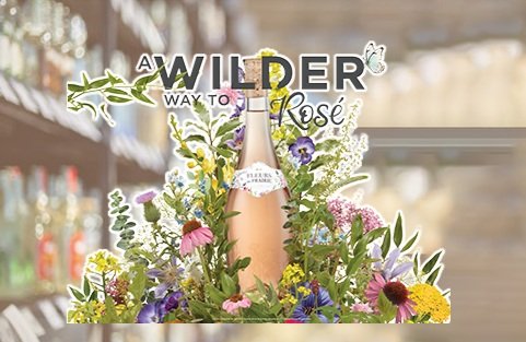
In an effort to stand out with a compelling visual and messaging, Fleurs de Prairie adopted a fresh brand positioning so consumers could feel more authentic and freer spirited than they would drinking other Rosés.
These attributes were highlighted by utilizing the unique shape and floral embossing of the bottle, as well as the new label which highlighted the wildflower assets unique to the brand. Additionally, wild flowers of the valleys in France were shown to bring the wilder and more organic spirit of the brand to life.
A photoshoot and extensive research into florals were necessary to create the final visual, as well as a hand-lettered “Rosé” to truly tie in to the “Wilder” theme. There were several in store pieces created, including a 3-case sleeve, dimensional pole topper, shelf talker, case card, wine charms and necker, window cling, cooler cling, and updated wine rack display.
New brand guidelines were designed in order to reflect updated usage of the floral assets to guide future photo shoots and align to the new visual identity, as well as a fresh color palette and font usage to accompany the look.
In addition, there were several sampling pieces, including an umbrella, table cloths, and towel.
Designer/Art Direction: Valentina Stefanidis
Photographer: Eddie Berman
Sr. Project Manager: Chau Nguyen


